Fuji Kitchen
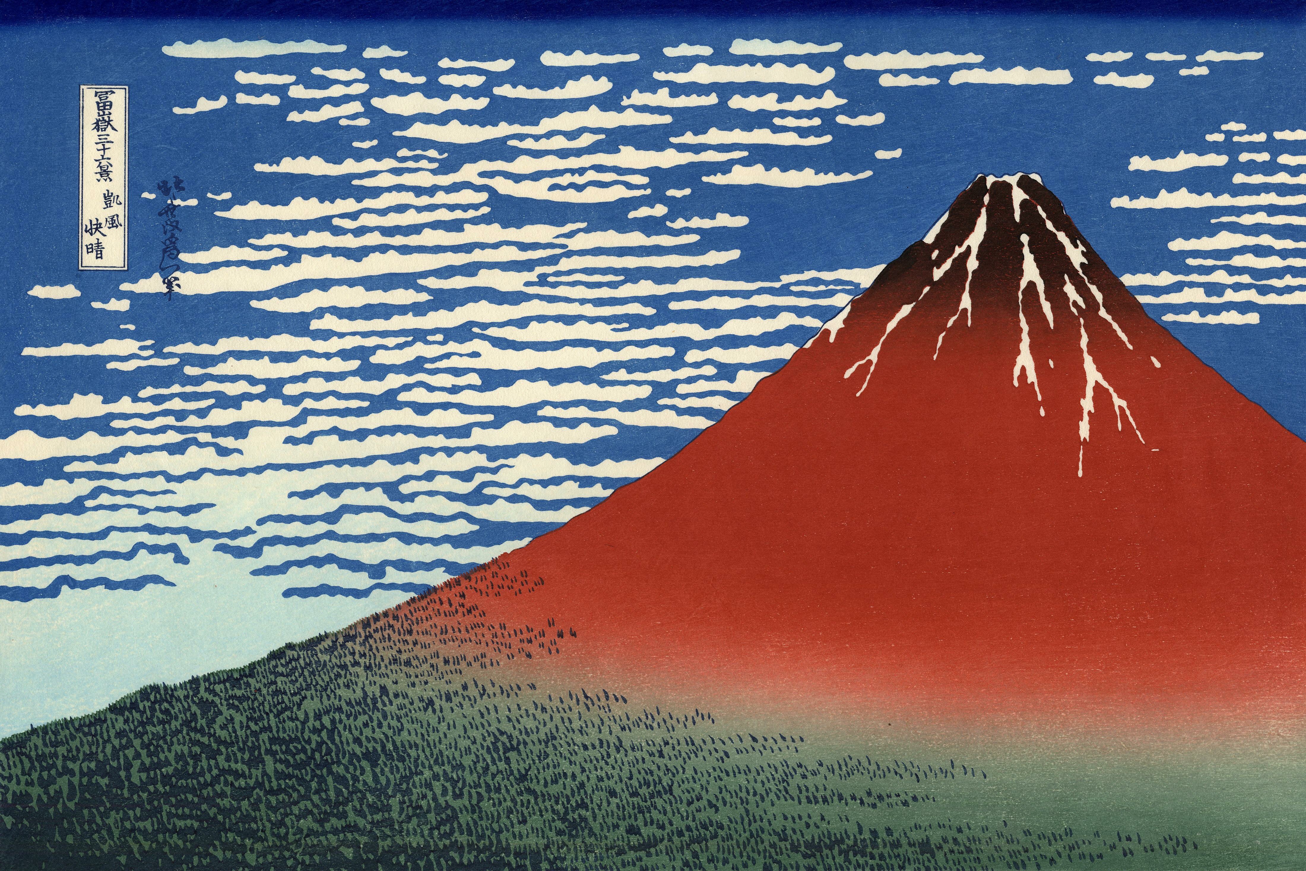
Fuji Kitchen is a japanese restaurant which concept revolves around Tokyo's Izakayas. The inspiration for the logo comes from Hokusai's 1832 painting "Southern Wind, Clear Morning", also known as the Red Fuji.
The color palette was resourced from the predominant colors in the painting. The calmness, simplicity and elegance that the painting evokes were the same elements the restaurant wanted to inspire to their clients.
The graphic design had to harmonize with the interior design so that the entire concept could be coherent, so to work that through we opted to find the balance between the minimalism the graphic design required and the maximalism the interior design had. This was achieved through graphic elements of balance, volume and composition.
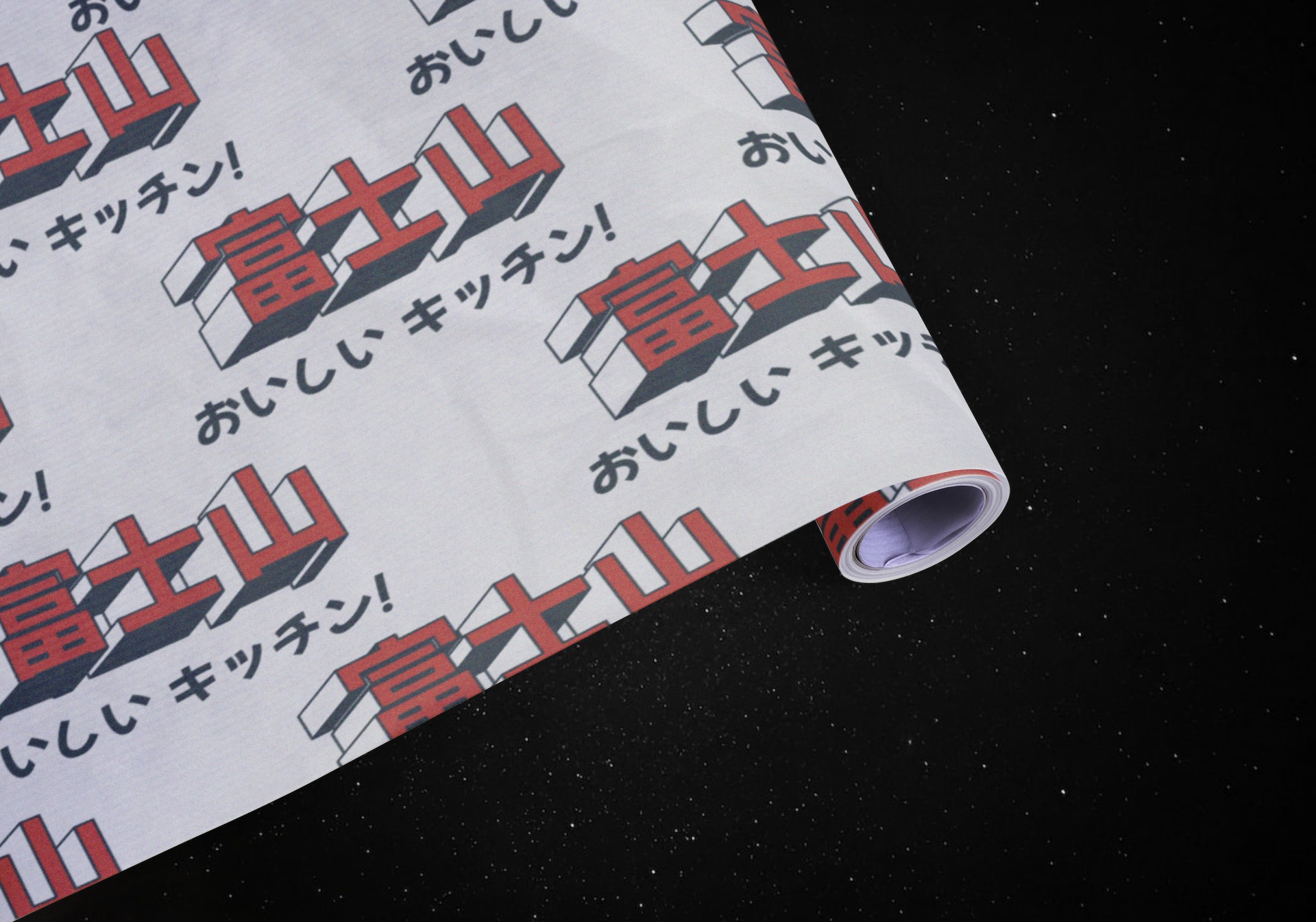
The go to boxes required paper for the inside of the packages, so this was the proposed design. It needed to be fun, bold and clean.
The variations of colors could be used in the menus, as well as business cards, uniforms and social media features.
The uniform was intended to be as casual and comfortable as possible going along with the initial concept of Izakaya stands. A graphic t-shirt was the obvious edgy choice, so we took advantage of the already designed graphic elements to continue with the same path of components clients could associate with the brand right away.